WE HELP AND CARE
WE HELP AND CARE
WE HELP AND CARE
WE HELP AND CARE
Navigating safety concerns to
unlock new funding channels
Navigating safety concerns to
unlock new funding channels
Navigating safety concerns to unlock new funding channels
Navigating safety concerns to unlock new funding channels
Role
Role
Role
UX Design Apprentice
UX Design Apprentice
UX Design Apprentice
UX Design Apprentice
Team Structure
Team Structure
Team Structure
Project Management (3)
Project Management (3)
Project Management (3)
Project Management (3)
Project Strategy (4)
Project Strategy (4)
Project Strategy (4)
Project Strategy (4)
UX Research (5)
UX Research (5)
UX Research (5)
UX Research (5)
UX Design (6) -- I was part of this team as a UX Design Apprentice
UX Design (6) -- I was part of this team as a UX Design Apprentice
UX Design (6) -- I was part of this team as a UX Design Apprentice
UX Design (6) -- I was part of this team as a UX Design Apprentice
Timeline
Timeline
Timeline
8 weeks (4- 2 week sprints)
8 weeks (4- 2 week sprints)
8 weeks (4- 2 week sprints)
8 weeks (4- 2 week sprints)
Deliverables
Deliverables
Deliverables
Website Audit, Competitive Analysis, Information Architecture, User Personas, Mid-fi Wireframes & Prototype, User Testing Guide, Branding Guidelines, UI Design System
Website Audit, Competitive Analysis, Information Architecture, User Personas, Mid-fi Wireframes & Prototype, User Testing Guide, Branding Guidelines, UI Design System
Website Audit, Competitive Analysis, Information Architecture, User Personas, Mid-fi Wireframes & Prototype, User Testing Guide, Branding Guidelines, UI Design System
Website Audit, Competitive Analysis, Information Architecture, User Personas, Mid-fi Wireframes & Prototype, User Testing Guide, Branding Guidelines, UI Design System


01 OVERVIEW
New avenue to generate donations
New avenue to generate donations
New avenue to generate donations
New avenue to generate donations
Problem
Problem
We Help & Care (WHC) is a non-profit humanitarian aid organization that aids those in need in Myanmar, including those displaced by the Myanmar Crisis. Their main source of funding is from direct solicitation from friends, family, and local businesses. WHC's existing website was failing to generate online donations. From our research, we found that WHC’s main problem was garnering trust and transparency from visitors.
We Help & Care (WHC) is a non-profit humanitarian aid organization that aids those in need in Myanmar, including those displaced by the Myanmar Crisis. Their main source of funding is from direct solicitation from friends, family, and local businesses. WHC's existing website was failing to generate online donations. From our research, we found that WHC’s main problem was garnering trust and transparency from visitors.
We Help & Care (WHC) is a non-profit humanitarian aid organization that aids those in need in Myanmar, including those displaced by the Myanmar Crisis. Their main source of funding is from direct solicitation from friends, family, and local businesses. WHC's existing website was failing to generate online donations. From our research, we found that WHC’s main problem was garnering trust and transparency from visitors.
We Help & Care (WHC) is a non-profit humanitarian aid organization that aids those in need in Myanmar, including those displaced by the Myanmar Crisis. Their main source of funding is from direct solicitation from friends, family, and local businesses. WHC's existing website was failing to generate online donations. From our research, we found that WHC’s main problem was garnering trust and transparency from visitors.
Goals
Goals
Redesign the website to build trust and transparency, communicate WHC's mission, and increase donations.
Redesign the website to build trust and transparency, communicate WHC's mission, and increase donations.
Redesign the website to build trust and transparency, communicate WHC's mission, and increase donations.
Redesign the website to build trust and transparency, communicate WHC's mission, and increase donations.
Constraints
Constraints
Privacy Concerns WHC's involvement with Internally Displaced People (IDPs) makes it necessary to protect the privacy of their team, partner organizations, and those they help from potential retaliation by military forces. This placed limiting factors on the information and images shared on the website.
Privacy Concerns WHC's involvement with Internally Displaced People (IDPs) makes it necessary to protect the privacy of their team, partner organizations, and those they help from potential retaliation by military forces. This placed limiting factors on the information and images shared on the website.
Privacy Concerns WHC's involvement with Internally Displaced People (IDPs) makes it necessary to protect the privacy of their team, partner organizations, and those they help from potential retaliation by military forces. This placed limiting factors on the information and images shared on the website.
Privacy Concerns WHC's involvement with Internally Displaced People (IDPs) makes it necessary to protect the privacy of their team, partner organizations, and those they help from potential retaliation by military forces. This placed limiting factors on the information and images shared on the website.
02 DISCOVERY
Receiving feedback from users
Receiving feedback from users
Receiving feedback from users
Receiving feedback from users
Before our team’s involvement, the first phase of the project conducted user testing of the website. Here's what they learned from users:
Before our team’s involvement, the first phase of the project conducted user testing of the website. Here's what they learned from users:
Before our team’s involvement, the first phase of the project conducted user testing of the website. Here's what they learned from users:
Before our team’s involvement, the first phase of the project conducted user testing of the website. Here's what they learned from users:
Lack of Understanding
Lack of Understanding
Lack of Understanding
Users struggled to understand WHC's projects, their impact, and the situation in Myanmar.
Users struggled to understand WHC's projects, their impact, and the situation in Myanmar.
Users struggled to understand WHC's projects, their impact, and the situation in Myanmar.
Outdated and Inconsistent
Outdated and Inconsistent
Outdated and Inconsistent
Projects were outdated and inconsistent language created confusion.
Projects were outdated and inconsistent language created confusion.
Projects were outdated and inconsistent language created confusion.
Limited Engagement
Limited Engagement
Limited Engagement
There were few incentives and outreach efforts to non-Burmese communities to donate.
There were few incentives and outreach efforts to non-Burmese communities to donate.
There were few incentives and outreach efforts to non-Burmese communities to donate.
Initial team thoughts: A first look
Initial team thoughts: A first look
Initial team thoughts: A first look
Initial team thoughts: A first look
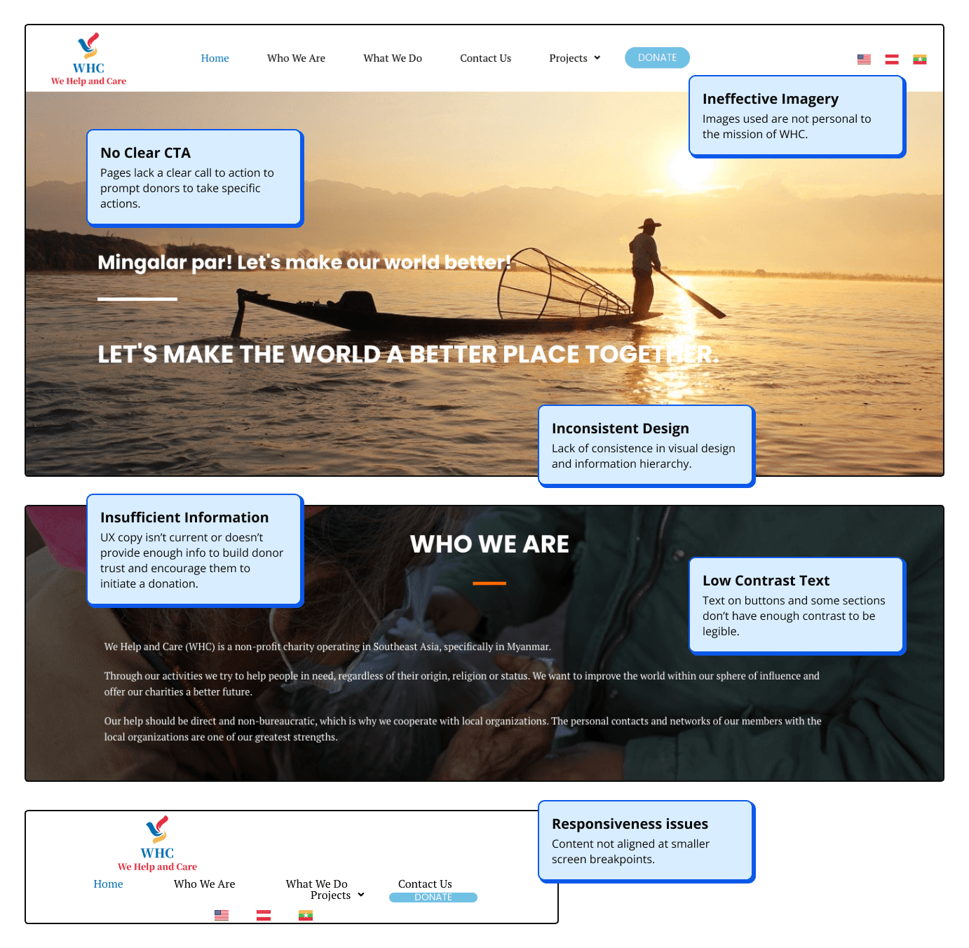
We suspected there could be technical or structural issues contributing to the poor user experience. After conducting a website audit, we found issues with quality of images, generic content, lack of call to action, inconsistent visual design, and accessibility issues.
We suspected there could be technical or structural issues contributing to the poor user experience. After conducting a website audit, we found issues with quality of images, generic content, lack of call to action, inconsistent visual design, and accessibility issues.
We suspected there could be technical or structural issues contributing to the poor user experience. After conducting a website audit, we found issues with quality of images, generic content, lack of call to action, inconsistent visual design, and accessibility issues.
We suspected there could be technical or structural issues contributing to the poor user experience. After conducting a website audit, we found issues with quality of images, generic content, lack of call to action, inconsistent visual design, and accessibility issues.


Evoking strong feelings in the non-profit sphere
Evoking strong feelings in the non-profit sphere
Evoking strong feelings in the non-profit sphere
Evoking strong feelings in the non-profit sphere
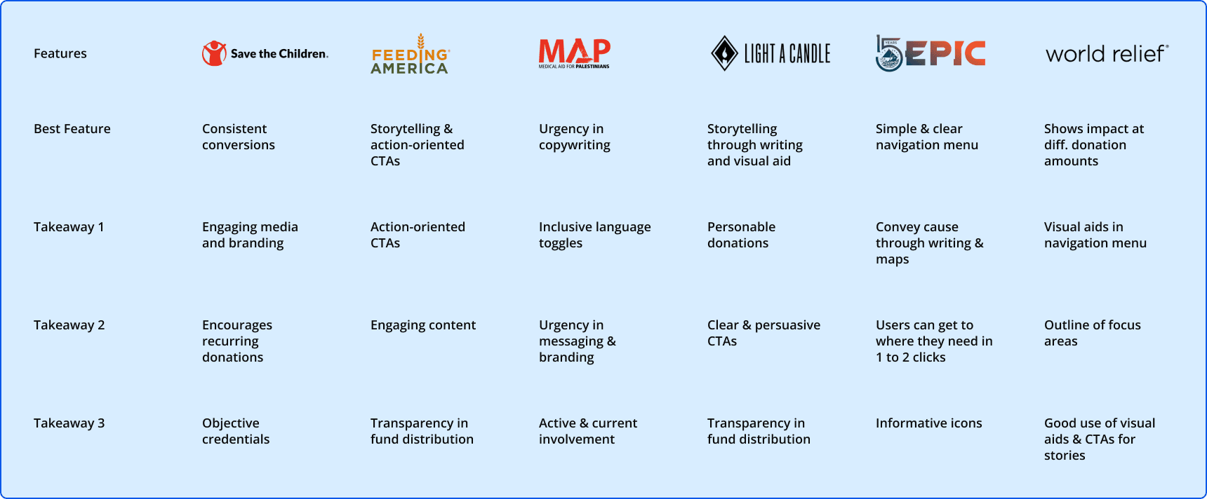
What could we learn from successful non-profit websites? We collaborated with UX Research to conduct a competitive analysis of 6 non-profit organizations. It revealed several key areas where these organizations exceled:
What could we learn from successful non-profit websites? We collaborated with UX Research to conduct a competitive analysis of 6 non-profit organizations. It revealed several key areas where these organizations exceled:
What could we learn from successful non-profit websites? We collaborated with UX Research to conduct a competitive analysis of 6 non-profit organizations. It revealed several key areas where these organizations exceled:
What could we learn from successful non-profit websites? We collaborated with UX Research to conduct a competitive analysis of 6 non-profit organizations. It revealed several key areas where these organizations exceled:
⟶ Strong Branding A clear and consistent brand identity.
⟶ Engaging Visuals Use of visuals that evoke empathy and emotional connection.
⟶ Transparency Informative and honest communication.
⟶ Persuasive CTAs Clear and compelling calls to action.
⟶ Strong Branding A clear and consistent brand identity.
⟶ Engaging Visuals Use of visuals that evoke empathy and emotional connection.
⟶ Transparency Informative and honest communication.
⟶ Persuasive CTAs Clear and compelling calls to action.
⟶ Strong Branding A clear and consistent brand identity.
⟶ Engaging Visuals Use of visuals that evoke empathy and emotional connection.
⟶ Transparency Informative and honest communication.
⟶ Persuasive CTAs Clear and compelling calls to action.
⟶ Strong Branding A clear and consistent brand identity.
⟶ Engaging Visuals Use of visuals that evoke empathy and emotional connection.
⟶ Transparency Informative and honest communication.
⟶ Persuasive CTAs Clear and compelling calls to action.


Who are we serving?
Who are we serving?
Who are we serving?
Personas
Personas
Personas
Personas
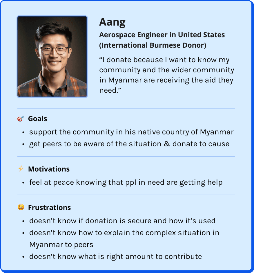
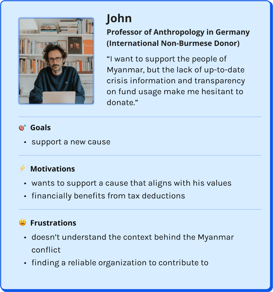
Before discussing solutions, we had to know who this website would serve and how to best meet their needs. Through a collaborative effort with Management, Strategy, and UX Research, we developed two user personas & user epics.
Before discussing solutions, we had to know who this website would serve and how to best meet their needs. Through a collaborative effort with Management, Strategy, and UX Research, we developed two user personas & user epics.
Before discussing solutions, we had to know who this website would serve and how to best meet their needs. Through a collaborative effort with Management, Strategy, and UX Research, we developed two user personas & user epics.
Before discussing solutions, we had to know who this website would serve and how to best meet their needs. Through a collaborative effort with Management, Strategy, and UX Research, we developed two user personas & user epics.




Epics
Epics
Epics
Epics
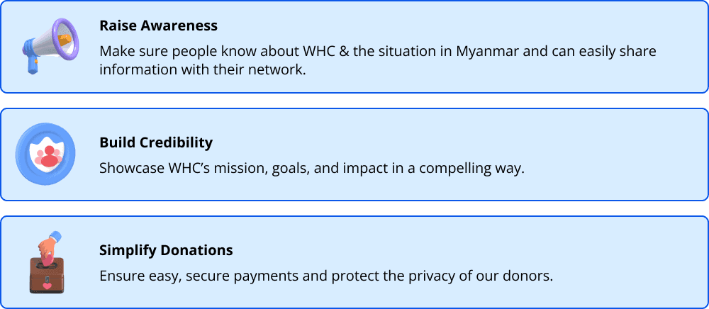
During our research, ideas for features were flying! With our tight timeline, we had to prioritize what would truly make a difference for our users. We created user stories for our two personas and grouped their needs into broader epics. This helped us focus development on three main areas:
During our research, ideas for features were flying! With our tight timeline, we had to prioritize what would truly make a difference for our users. We created user stories for our two personas and grouped their needs into broader epics. This helped us focus development on three main areas:
During our research, ideas for features were flying! With our tight timeline, we had to prioritize what would truly make a difference for our users. We created user stories for our two personas and grouped their needs into broader epics. This helped us focus development on three main areas:
During our research, ideas for features were flying! With our tight timeline, we had to prioritize what would truly make a difference for our users. We created user stories for our two personas and grouped their needs into broader epics. This helped us focus development on three main areas:


03 DESIGN
Melding ideas for impact
Melding ideas for impact
Melding ideas for impact
Melding ideas for impact
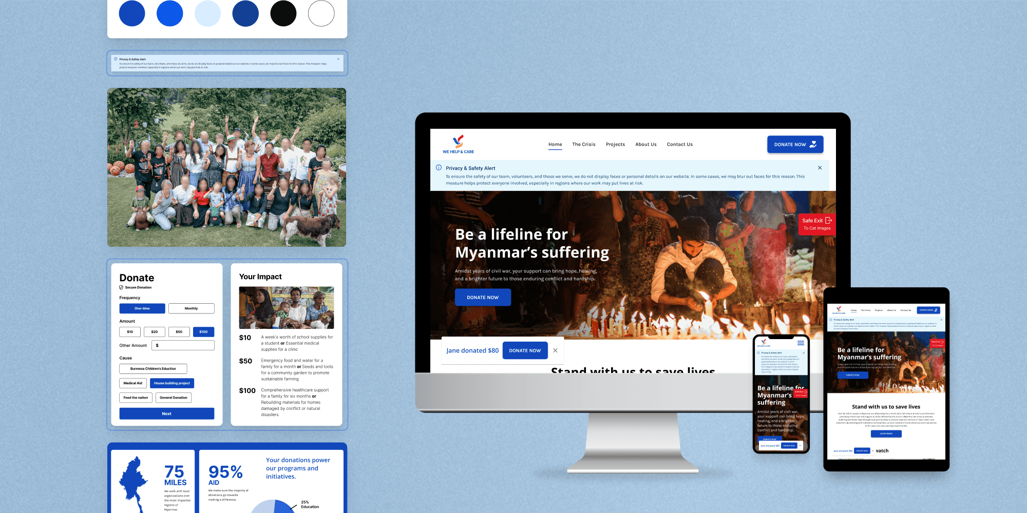
Using the Information Architecture, created in a joint effort by our 4 teams, our Design team designed 6 responsive mid-fidelity landing pages for desktop, tablet, and mobile screens.
Breaking off into teams of 2, I worked with Nikhil Cheerla, a lead UX Designer, on the Homepage and Donation page. Initially, we worked together to develop each section, but with both of us throwing out so many ideas, it overwhelmed our process. I proposed an ideation session to generate ideas independently and reconvene with our sketches to choose or combine the best elements.
Donation Form
Donation Form
Donation Form
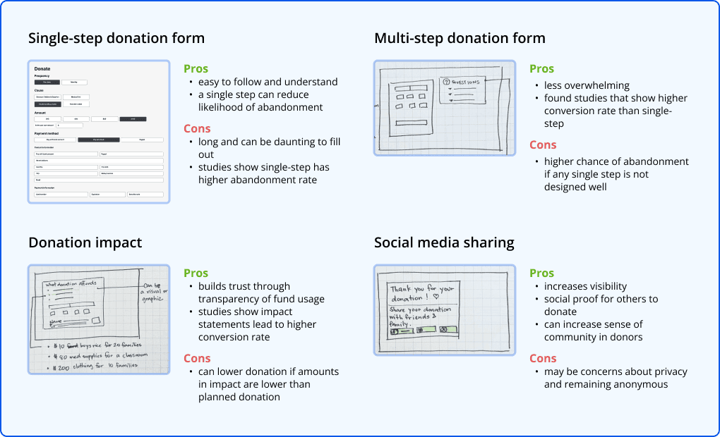
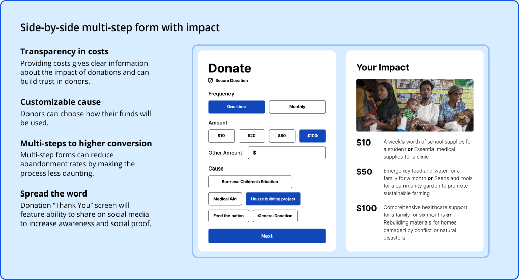
Even though we were using a third-party payment processor, we wanted to make sure our client had all the information they needed to choose the best one. We needed a payment solution that would provide seamless transactions and gave users control over how they donated.
Even though we were using a third-party payment processor, we wanted to make sure our client had all the information they needed to choose the best one. We needed a payment solution that would provide seamless transactions and gave users control over how they donated.
Even though we were using a third-party payment processor, we wanted to make sure our client had all the information they needed to choose the best one. We needed a payment solution that would provide seamless transactions and gave users control over how they donated.
Even though we were using a third-party payment processor, we wanted to make sure our client had all the information they needed to choose the best one. We needed a payment solution that would provide seamless transactions and gave users control over how they donated.
Donation Form Ideation
Donation Form Ideation
Donation Form Ideation


Donation Form Mid-Fidelity Mockup
Donation Form Mid-Fidelity Mockup
Donation Form Mid-Fidelity Mockup


Our Impact
Our Impact
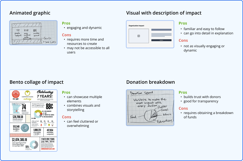
People were having trouble understanding what WHC was about. We needed a way for users to break through the wall of generic images and vague text to connect with We Help & Care. We wanted people to feel like their donations would make a difference and that they could trust WHC to make an impact with their contributions.
People were having trouble understanding what WHC was about. We needed a way for users to break through the wall of generic images and vague text to connect with We Help & Care. We wanted people to feel like their donations would make a difference and that they could trust WHC to make an impact with their contributions.
People were having trouble understanding what WHC was about. We needed a way for users to break through the wall of generic images and vague text to connect with We Help & Care. We wanted people to feel like their donations would make a difference and that they could trust WHC to make an impact with their contributions.
People were having trouble understanding what WHC was about. We needed a way for users to break through the wall of generic images and vague text to connect with We Help & Care. We wanted people to feel like their donations would make a difference and that they could trust WHC to make an impact with their contributions.
Impact Ideation
Impact Ideation
Impact Ideation


Impact Mid-Fidelity Mockup
Impact Mid-Fidelity Mockup
Impact Mid-Fidelity Mockup


Safety Concerns
Safety Concerns
Safety Concerns
There were 2 safety concerns we had to acknowledge: protecting visitors and protecting the people of WHC.
There were 2 safety concerns we had to acknowledge: protecting visitors and protecting the people of WHC.
There were 2 safety concerns we had to acknowledge: protecting visitors and protecting the people of WHC.
There were 2 safety concerns we had to acknowledge: protecting visitors and protecting the people of WHC.
Protecting visitors Given the dangerous situation in Myanmar, visiting WHC’s website could be risky. We needed to make sure people felt safe and anonymous when they were on our site.
Protecting visitors Given the dangerous situation in Myanmar, visiting WHC’s website could be risky. We needed to make sure people felt safe and anonymous when they were on our site.
Protecting visitors Given the dangerous situation in Myanmar, visiting WHC’s website could be risky. We needed to make sure people felt safe and anonymous when they were on our site.
Protecting visitors Given the dangerous situation in Myanmar, visiting WHC’s website could be risky. We needed to make sure people felt safe and anonymous when they were on our site.
Visitor Safety Inspiration
Visitor Safety Inspiration
Visitor Safety Inspiration


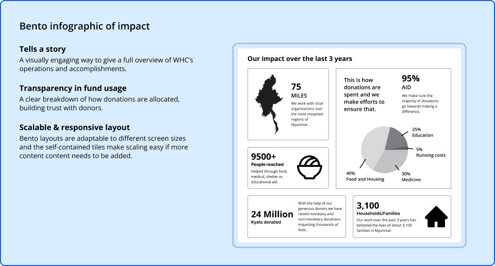
Protecting WHC As we added images to our prototype, I noticed that the About Us page still felt off. Instead of using WHC’s photos with blurred faces, we went with stock photos - we thought the blurring might make users feel more distant and untrustworthy. But I had an idea: if we could explain why we blurred the faces and why there was limited information about the people behind WHC, we might be able to use those real photos. It could help people feel more connected and trust the organization by providing more transparency.
Protecting WHC As we added images to our prototype, I noticed that the About Us page still felt off. Instead of using WHC’s photos with blurred faces, we went with stock photos - we thought the blurring might make users feel more distant and untrustworthy. But I had an idea: if we could explain why we blurred the faces and why there was limited information about the people behind WHC, we might be able to use those real photos. It could help people feel more connected and trust the organization by providing more transparency.
Protecting WHC As we added images to our prototype, I noticed that the About Us page still felt off. Instead of using WHC’s photos with blurred faces, we went with stock photos - we thought the blurring might make users feel more distant and untrustworthy. But I had an idea: if we could explain why we blurred the faces and why there was limited information about the people behind WHC, we might be able to use those real photos. It could help people feel more connected and trust the organization by providing more transparency.
Protecting WHC As we added images to our prototype, I noticed that the About Us page still felt off. Instead of using WHC’s photos with blurred faces, we went with stock photos - we thought the blurring might make users feel more distant and untrustworthy. But I had an idea: if we could explain why we blurred the faces and why there was limited information about the people behind WHC, we might be able to use those real photos. It could help people feel more connected and trust the organization by providing more transparency.
WHC Safety Inspiration
WHC Safety Inspiration
WHC Safety Inspiration


Safety Features Mid-Fidelity Mockup
Safety Features Mid-Fidelity Mockup
Safety Features Mid-Fidelity Mockup


Prepare for functionality testing
Prepare for functionality testing
Prepare for functionality testing
Prepare for functionality testing
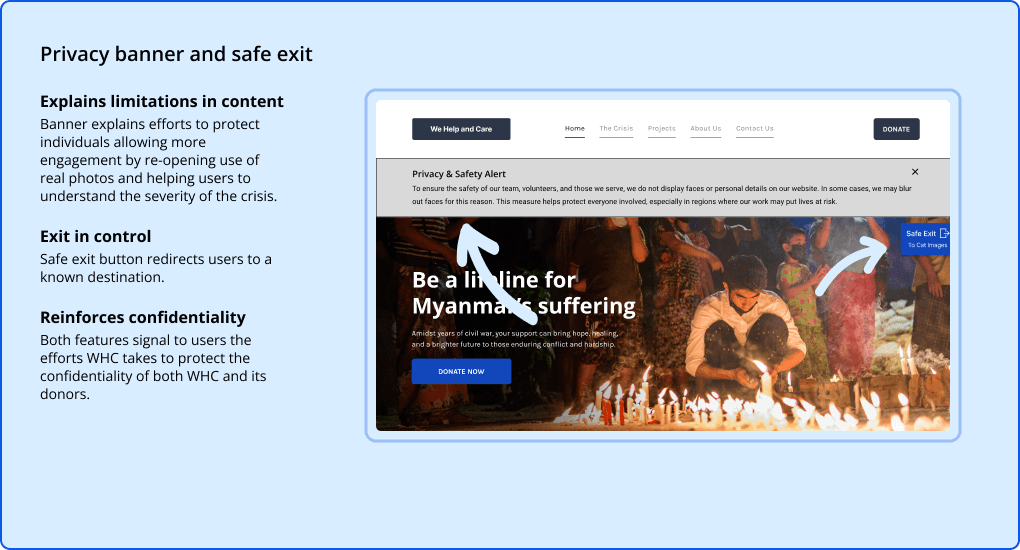
The development of the mid-fidelity wireframes resulted in a lot of structural changes and feature additions. We wanted to test the wireframes to ensure the changes would help our client to meet their goals. We prototyped the wireframes and collaborated with UX Research to develop questions for testing.
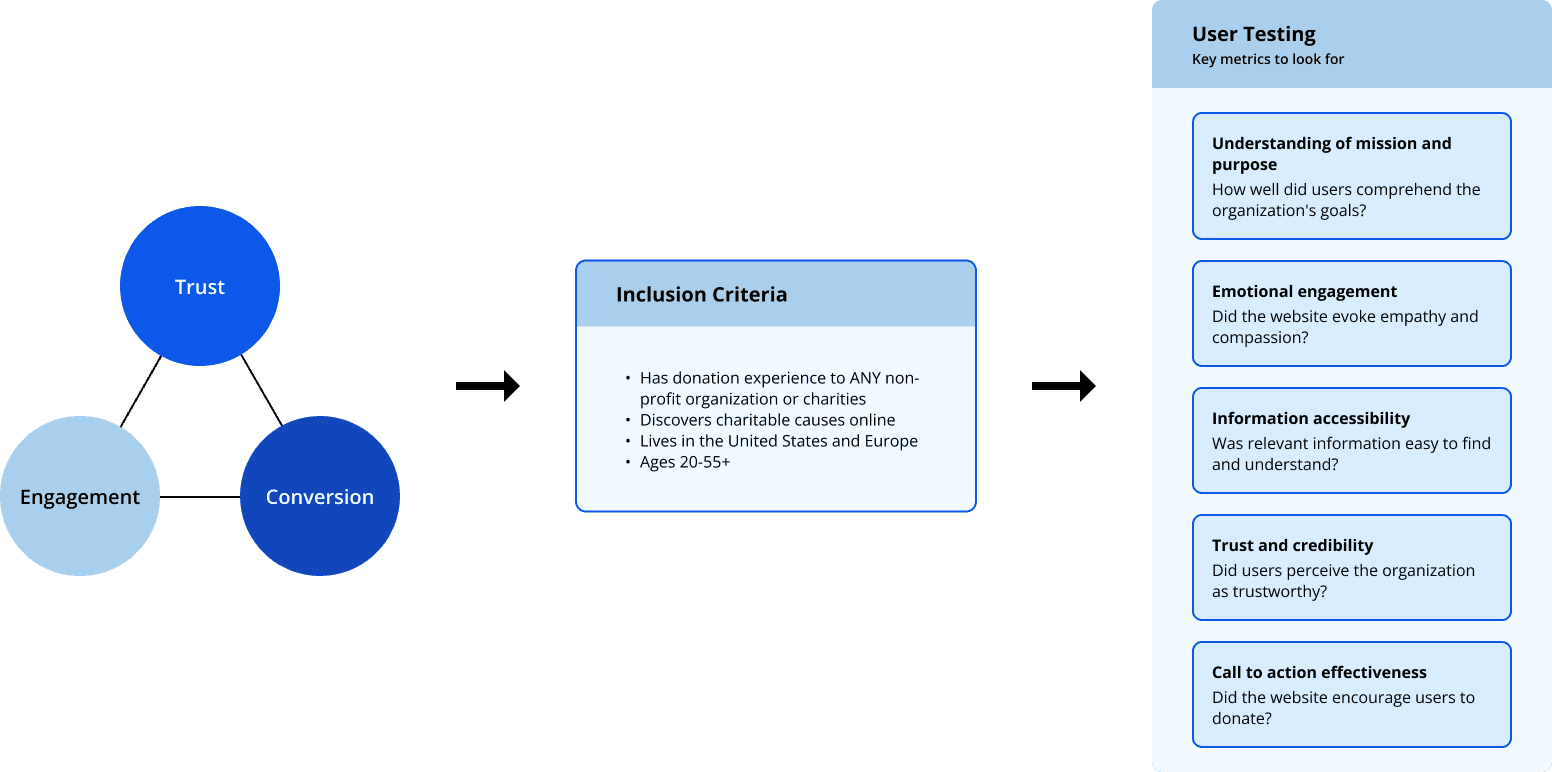
Although, we ran out of time to recruit enough users for testing, we are ready to hand off recruitment criteria, user testing questions, and prototyped screens to the next phase's team. We expect to see improved feedback from users regarding trust, engagement, and conversion.


04 USER INTERFACE
Visual Consistency is Key
Visual Consistency is Key
Visual Consistency is Key
Visual Consistency is Key
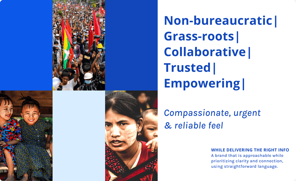
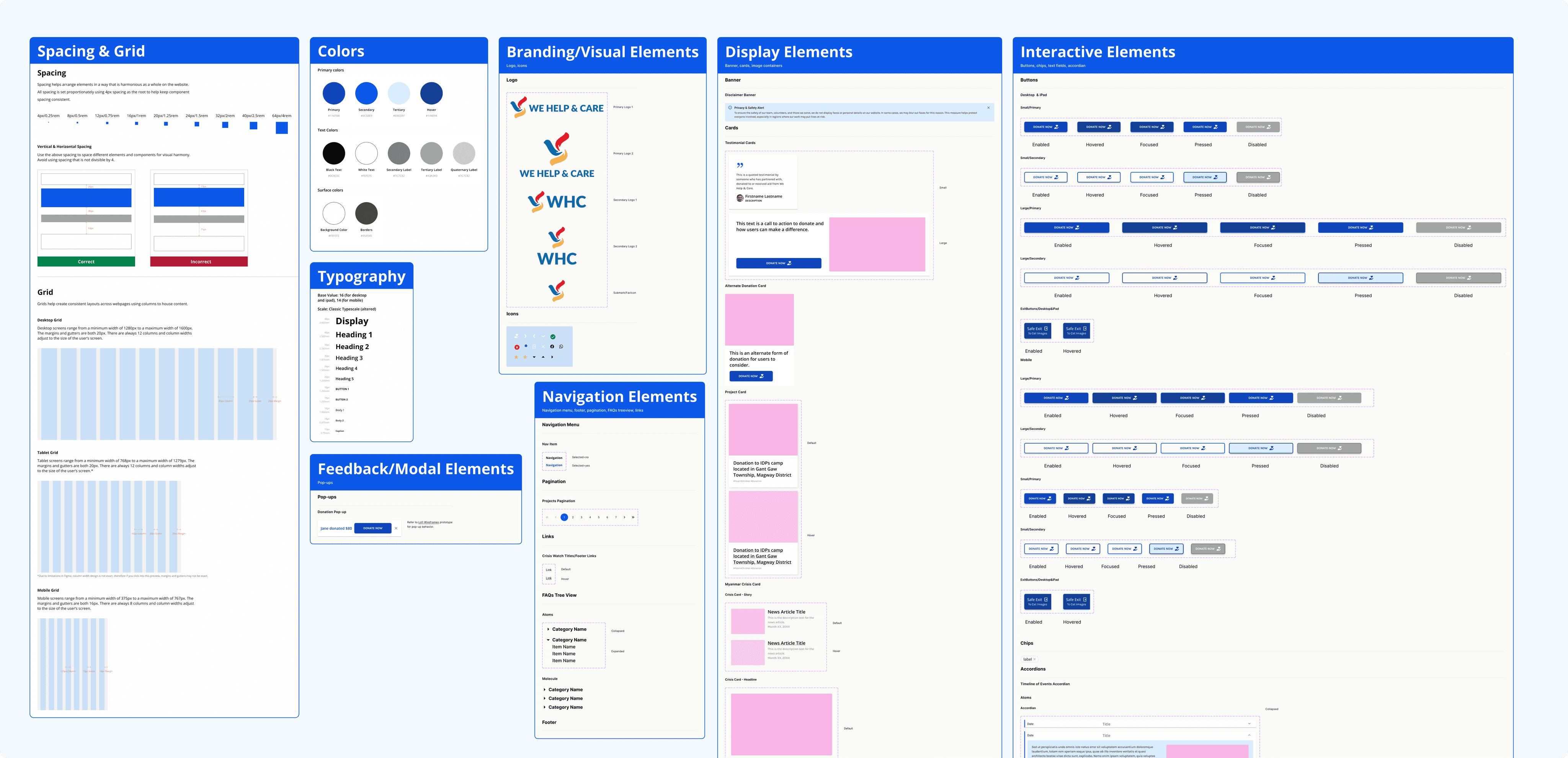
In preparation for the High-fidelity wireframes we created Brand Guidelines and a UI Design System. It was clear from our competitive analysis that what we needed was strong, consistent branding to deliver our message and inspire people to support WHC’s cause. I led the branding workshop for the design team and we came up with a set of branding guidelines and a UI design system.
In preparation for the High-fidelity wireframes we created Brand Guidelines and a UI Design System. It was clear from our competitive analysis that what we needed was strong, consistent branding to deliver our message and inspire people to support WHC’s cause. I led the branding workshop for the design team and we came up with a set of branding guidelines and a UI design system.
In preparation for the High-fidelity wireframes we created Brand Guidelines and a UI Design System. It was clear from our competitive analysis that what we needed was strong, consistent branding to deliver our message and inspire people to support WHC’s cause. I led the branding workshop for the design team and we came up with a set of branding guidelines and a UI design system.
In preparation for the High-fidelity wireframes we created Brand Guidelines and a UI Design System. It was clear from our competitive analysis that what we needed was strong, consistent branding to deliver our message and inspire people to support WHC’s cause. I led the branding workshop for the design team and we came up with a set of branding guidelines and a UI design system.




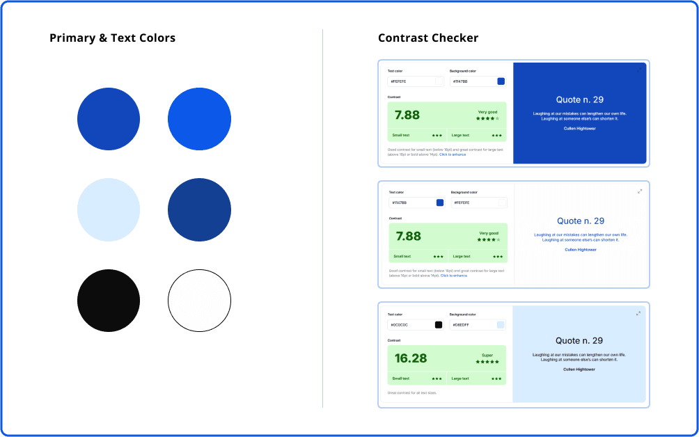
Originally, we chose orange and blue as the primary colors for WHC to represent compassion and trust. After several rounds of testing shades of orange, we couldn't get the colors to pass Web Content Accessibility Guidelines (WCAG) contrast checker. Ultimately, we made the decision to remove orange from the palette. This allowed us to prioritize accessibility while still maintaining a trustworthy and engaging design.
Originally, we chose orange and blue as the primary colors for WHC to represent compassion and trust. After several rounds of testing shades of orange, we couldn't get the colors to pass Web Content Accessibility Guidelines (WCAG) contrast checker. Ultimately, we made the decision to remove orange from the palette. This allowed us to prioritize accessibility while still maintaining a trustworthy and engaging design.
Originally, we chose orange and blue as the primary colors for WHC to represent compassion and trust. After several rounds of testing shades of orange, we couldn't get the colors to pass Web Content Accessibility Guidelines (WCAG) contrast checker. Ultimately, we made the decision to remove orange from the palette. This allowed us to prioritize accessibility while still maintaining a trustworthy and engaging design.
Originally, we chose orange and blue as the primary colors for WHC to represent compassion and trust. After several rounds of testing shades of orange, we couldn't get the colors to pass Web Content Accessibility Guidelines (WCAG) contrast checker. Ultimately, we made the decision to remove orange from the palette. This allowed us to prioritize accessibility while still maintaining a trustworthy and engaging design.


05 REFLECTIONS & NEXT STEPS
Laying the foundation for growth
Laying the foundation for growth
Laying the foundation for growth
Laying the foundation for growth
Despite our communication challenges, our team successfully delivered a detailed redesign proposal that addresses the clients’ goals and key user issues. The proposed redesign includes clear and consistent messaging and a more engaging user experience aimed at increasing donations and broadening WHC's reach. Our work provides WHC with a strong foundation to move forward with their website redesign — they can more effectively communicate their mission and raise the necessary funds to continue their work in Myanmar.
Our next steps will be to handoff our work to the next phase. We will prepare the next team for user testing of the midfi prototype and continued development of the website.
let's work together
lsportis@gmail.com
©2024
Go Back To Top
©2024
Go Back To Top
©2024
Go Back To Top
©2024
Go Back To Top
